ASP.NET Standard controls overview
Radio and Checkbox List controls
Represents a list control that encapsulates a group of radio button controls. The RadioButtonList control provides page developers with a single-selection radio button group that can be dynamically generated through data binding. It contains an Items collection with members that correspond to individual items on the list. To determine which item is selected, test the SelectedItem property of the list.
Example
Literal Control
The Literal control is used to display text on a page. The text is programmable. Represents HTML elements, text, and any other strings in an ASP.NET page that do not require processing on the server.
Note: This control does not let you apply styles to its content!
ASP.NET compiles all HTML elements and readable text that do not require server-side processing into instances of this class. For example, an HTML element that does not contain a runat="server" attribute/value pair in its opening tag is compiled into a LiteralControl object. LiteralControl objects do not maintain view state, so the contents of a LiteralControl object must be recreated on each request.
Literal controls behave as text holders, meaning that you can extract text from the literal control and remove the literal control from the parent server control's ControlCollection collection through the parent's Controls property. Therefore, when you develop a custom control derived from the LiteralControl class, make sure your control performs any required preprocessing steps itself, rather than using a call to the LiteralControl.Render method to accomplish them. Typically, you would do this to improve the response time of your Web application.
You can add or remove literal controls from a page or server control programmatically using the ControlCollection.Add or the ControlCollection.Remove method, respectively.
Example 1
Example 2
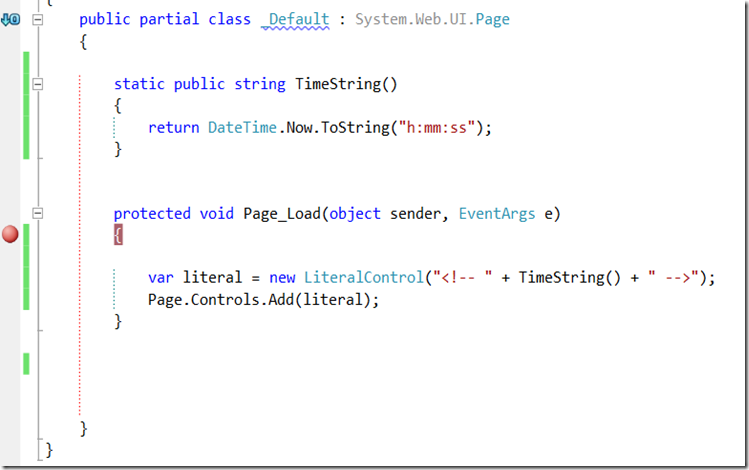
To display the dynamic and programmable information to the web page as below example inserts timestamp on every page request.
Localize Web Control
You can add a Localize Web server control to your ASP.NET Web page when you want to display localized text in a specific area on the page. The Localize control is identical to the Literal Web server control and similar to the Label Web server control. While the Label control allows you to apply a style to the displayed text, the Localize control does not. You can programmatically control the text that is displayed in the Localize control by setting the Text property, which is inherited from the Literal control. For more information, see Literal Web Server Control Overview.
To localize regular HTML content, you can use the <asp:Localize> control. Let’s use an example to explain it.
You have a header and a paragraph in your page.
Localizing Text Using Resource Strings
You can create localized strings to display in the Text property of the Localize control by using an explicit or implicit expression as the value of the property. Expressions are evaluated by using strings that are declared in resource (.resx) files.
Create your .resx files in folders called App_GlobalResources and App_LocalResources in the root of your application. If you need to localize strings for multiple languages, you can create additional .resx files with locale information included in the file name. For example, the French version of your resource file would be named ExampleLocalizedStrings.fr.resx.
Example
ImageMap control
The ImageMap control consists primarily of two pieces. The first is an image, which can be a graphic in any standard web graphic format, such as a .gif, .jpg, or .png file.
The second element is a collection of hotspot controls. Each hotspot control is a different element. For each hotspot control, you define its shape — a circle, rectangle, or polygon — and the coordinates that specify the location and size of the hot spot. For example, if you create a circle hot spot, you define the x and y coordinates of the circle's center and the circle's radius.
Multi-Views and View Controls
Example:
Wizard Control
The ASP.NET Wizard control simplifies many of the tasks associated with building forms and collecting user input. In this walkthrough, you use the Wizard control to create a form that collects a user's address information, allows them to opt in or opt out of e-mail updates, and then presents the data and choices back to them in a final confirmation step. Tasks illustrated in this walkthrough include:
Example
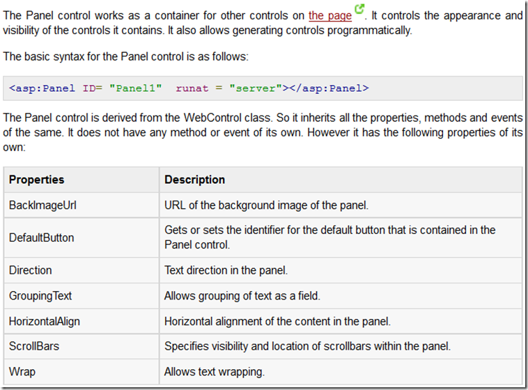
Panel Control
Example
Place Holder Control
The PlaceHolder control is used to reserve space for controls added by code.
Note: The PlaceHolder control does not produce any visible output (it only acts as a container for other controls on the Web page).
Example:
Substitution Control
The Substitution control lets you create areas on the page that can be updated dynamically and then integrated into a cached page.
Use the Substitution control to specify a section of an output-cached Web page where you want to display dynamic content. The Substitution control offers a simplified solution to partial page caching for pages where the majority of the content is cached. You can output-cache the entire page, and then use Substitution controls to specify the parts of the page that are exempt from caching. Cached regions execute only once and are read from the cache until the cache entry expires or is purged. Dynamic regions execute every time that the page is requested. This caching model simplifies the code for pages that are primarily static, because you do not have to encapsulate the sections to cache in Web user controls.
For example, this caching model is useful in a scenario where you have a page that contains static content, such as news stories, and an AdRotator control that displays advertisements. The news stories do not change frequently, which means that they can be cached. However, every time that a user requests the page, you want to display a new advertisement. The AdRotator control directly supports post-cache substitution and renders a new advertisement every time that the page posts back, regardless of whether the page is cached.
Example
The following example shows how to use the Substitution control to create dynamically updated content on a cached page. Code in the page's Load event updates a Label control with the current time. Because the page's cache duration is set to 60 seconds, the text of the Label control does not change even if the page is requested multiple times during the 60-second period. A Substitution control on the page calls the static method GetTime, which returns the current time as a string. Every time that the page is refreshed, the value represented by the Substitution control is updated.
XML Control
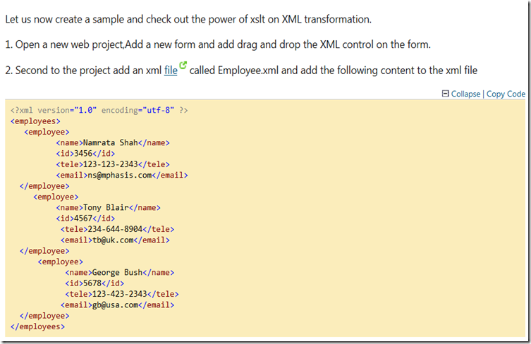
The XML control is used to display an XML document or the results of an XSL Transform.
Note: At least one of the XML Document properties must be set or no XML document is displayed.
You can also specify an XSLT document that will format the XML document before it is written to the output. You can format the XML document with the Transform property or the Transform Source property.
Example
Validation Controls
A Validation server control is used to validate the data of an input control. If the data does not pass validation, it will display an error message to the user.
CompareValidator Control
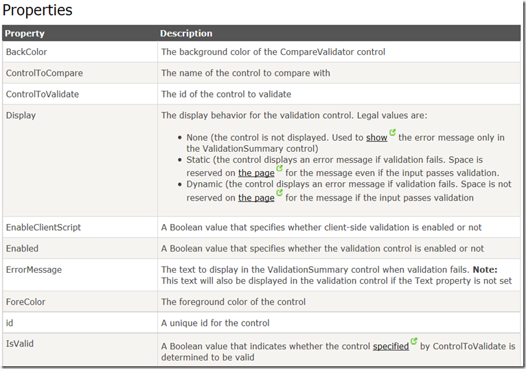
The CompareValidator control is used to compare the value of one input control to the value of another input control or to a fixed value.
Note: If the input control is empty, the validation will succeed. Use the RequiredFieldValidator control to make the field required.
Example 1
Example 2
RangeValidator Control
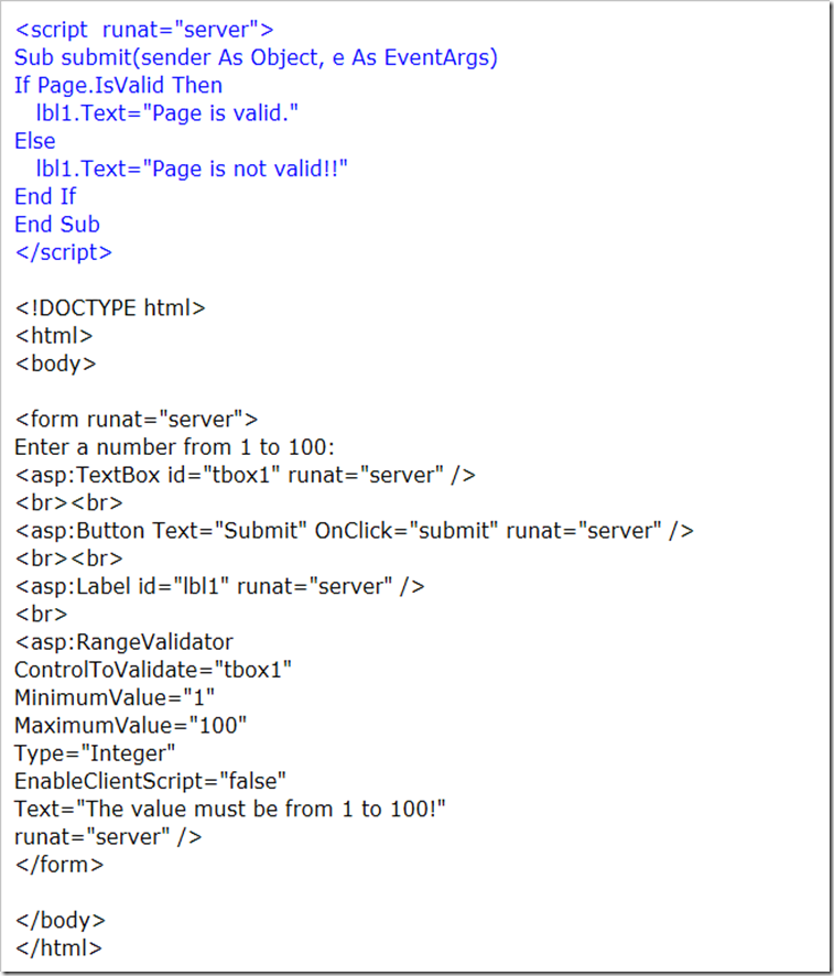
The RangeValidator control is used to check that the user enters an input value that falls between two values. It is possible to check ranges within numbers, dates, and characters.
Example 1
Example 2
RegularExpressionValidator Control
The RegularExpressionValidator control is used to ensure that an input value matches a specified pattern.
Note: Both server- and client-side validation are performed unless the browser does not support client-side validation or the EnableClientScript property is set to false.
Note: The validation will not fail if the input control is empty. Use the RequiredFieldValidator control to make the field required.
Example
RequiredFieldValidator Control
The RequiredFieldValidator control is used to make an input control a required field.
With this control, the validation fails if the input value does not change from its initial value. By default, the initial value is an empty string ("").
Note: Leading and trailing spaces of the input value are removed before validation.
Note: The InitialValue property does not set the default value for the input control. It indicates the value that you do not want the user to enter in the input control.
Example
CustomValidator Control
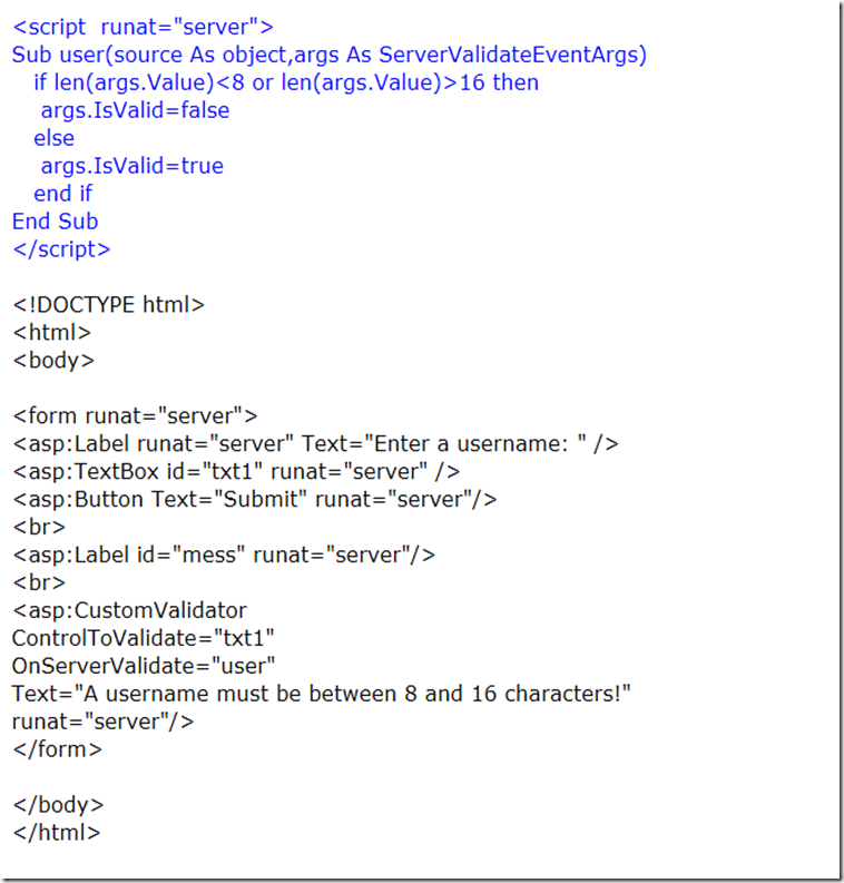
The CustomValidator control allows you to write a method to handle the validation of the value entered.
Example
ValidationSummary Control
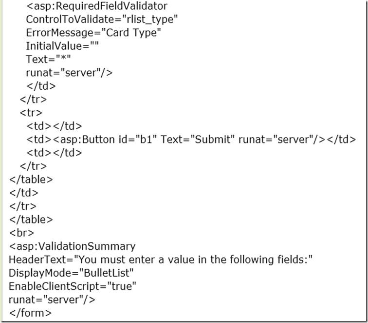
The ValidationSummary control is used to display a summary of all validation errors occurred in a Web page.
The error message displayed in this control is specified by the ErrorMessage property of each validation control. If the ErrorMessage property of the validation control is not set, no error message is displayed for that validation control.
Example 1
Navigation Control
Maintaining the menu of a large web site is difficult and time consuming.
In ASP.NET the menu can be stored in a file to make it easier to maintain. This file is normally called web.sitemap, and is stored in the root directory of the web.
In addition, ASP.NET has three new navigation controls:
- Dynamic menus
- TreeViews
- Site Map Path
Menu Control
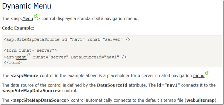
The ASP.NET Menu control allows you to develop both statically and dynamically displayed menus for your ASP.NET Web pages.
The Menu control has two modes of display: static and dynamic. Static display means that the Menu control is fully expanded all the time. The entire structure is visible, and a user can click on any part. In a dynamically displayed menu, only the portions you specify are static, while their child menu items are displayed when the user holds the mouse pointer over the parent node.
You can configure the contents of the Menu control directly in the control, or you can specify the contents by binding the control to a data source. Without writing any code, you can control the appearance, orientation, and content of an ASP.NET Menu control
Example
Login Controls
ASP.NET provides robust login (authentication) functionality for ASP.NET Web applications without requiring programming. The default Visual Studio project templates for Web applications and for Web sites include prebuilt pages that let users register a new account, log in, and change their passwords For information about how to use the built-in login page templates, see Walkthrough: Creating an ASP.NET Web Site with Basic User Login.
You can also create your own pages that you can add ASP.NET login controls to in order to add login functionality. To use the login controls, you create a Web pages and then add the login controls to them from the Toolbox.
Typically, you restrict access to ASP.NET pages by putting them into a protected folder. You then configure the folder to deny access to anonymous users (users who are not logged in) and to grant access to authenticated (logged-in) users. (The default project template for Web projects includes a folder named Accounts that is already configured to allow access only to logged-in users.) Optionally, you can assign users to roles and then authorize users to access specific Web pages by role.
By default, login controls integrate with ASP.NET membership and ASP.NET forms authentication to help automate user authentication for a Web site. For information about how to use ASP.NET membership with forms authentication, see Introduction to Membership.
By default, the ASP.NET login controls work in plain text over HTTP. If you are concerned about security, use HTTPS with SSL encryption.
Login UI Control
The Login control displays a user interface for user authentication. The Login control contains text boxes for the user name and password and a check box that allows users to indicate whether they want the server to store their identity using ASP.NET membership and automatically be authenticated the next time they visit the site.
The Login control has properties for customized display, for customized messages, and for links to other pages where users can change their password or recover a forgotten password. The Login control can be used as a standalone control on a main or home page, or you can use it on a dedicated login page.
If you use the Login control with ASP.NET membership, you do not need to write code to perform authentication. However, if you want to create your own authentication logic, you can handle the Login control's Authenticate event and add custom authentication code.
AJAX Controls
AJAX stands for Asynchronous JavaScript and XML. This is a cross platform technology which speeds up response time. The AJAX server controls add script to the page which is executed and processed by the browser.
However like other ASP.Net server controls, these AJAX server controls also can have methods and event handlers associated with them, which are processed on the server side.
The control toolbox in the Visual Studio IDE contains a group of controls called the 'AJAX Extensions'
Script Manager Proxy Class
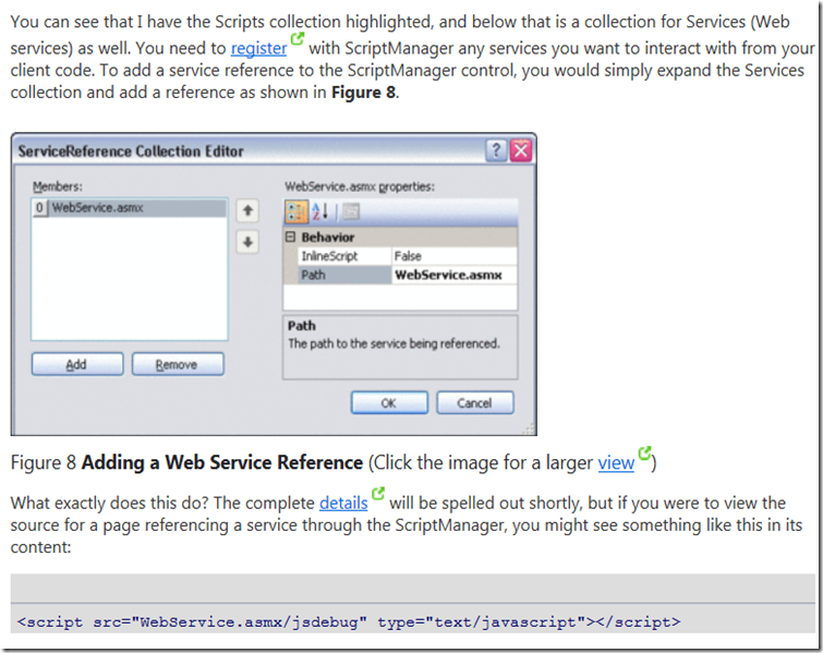
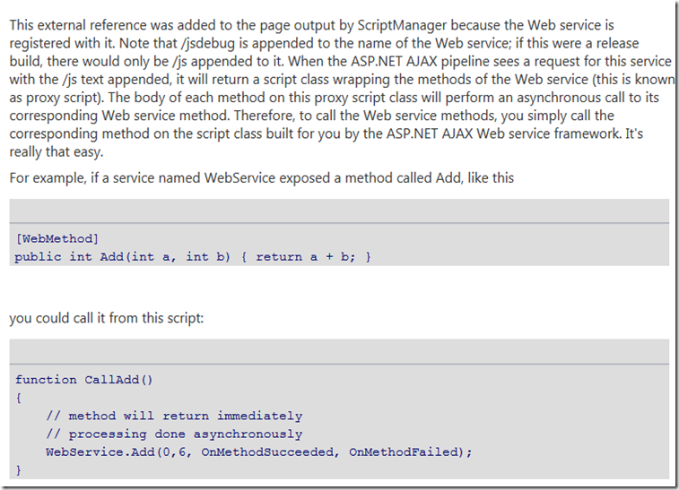
Enables nested components such as content pages and user controls to add script and service references to pages when a ScriptManager control is already defined in a parent element.
A Web page can contain only one ScriptManager control, either directly on the page or indirectly inside a nested or parent component. The ScriptManagerProxy control lets you add scripts and services to content pages and to user controls if the master page or host page already contains a ScriptManager control.
When you use the ScriptManagerProxy control, you can add to the script and service collections defined by the ScriptManager control. If you do not want to include specific scripts and services on every page that includes a particular ScriptManager control, you can remove them from the ScriptManager control. You can then add them to individual pages by using the ScriptManagerProxy control instead.
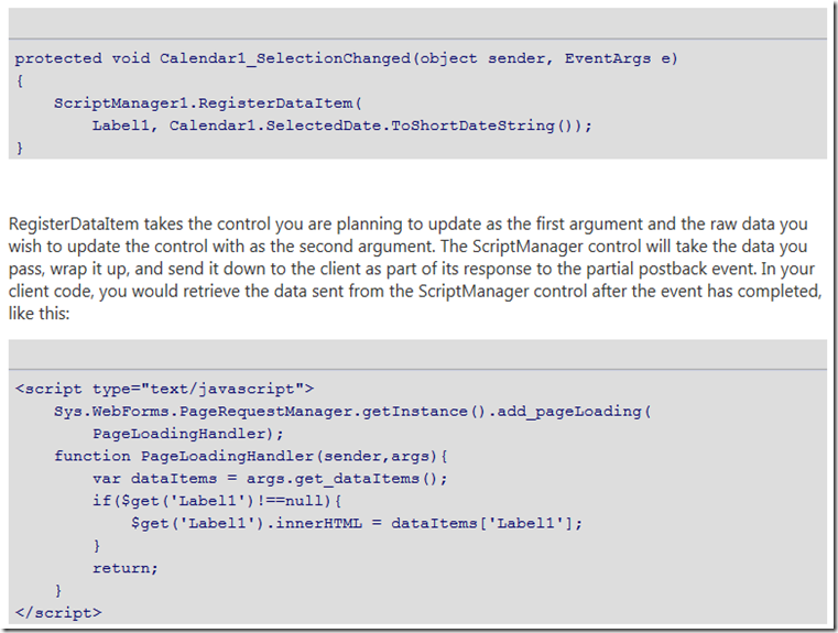
ASP.NET UpdatePanel controls enable you to build rich, client-centric Web applications. By using UpdatePanel controls, you can refresh selected parts of the page instead of refreshing the whole page with a postback. This is referred to as performing a partial-page update. An ASP.NET Web page that contains a ScriptManager control and one or more UpdatePanel controls can automatically participate in partial-page updates, without custom client script.
UpdatePanel controls work by specifying regions of a page that can be updated without refreshing the whole page. This process is coordinated by the ScriptManager server control and the client PageRequestManager class. When partial-page updates are enabled, controls can asynchronously post to the server. An asynchronous postback behaves like a regular postback in that the resulting server page executes the complete page and control life cycle. However, with an asynchronous postback, page updates are limited to regions of the page that are enclosed in UpdatePanel controls and that are marked to be updated. The server sends HTML markup for only the affected elements to the browser. In the browser, the client PageRequestManager class performs Document Object Model (DOM) manipulation to replace existing HTML with updated markup.
Example
Specifying UpdatePanel Triggers
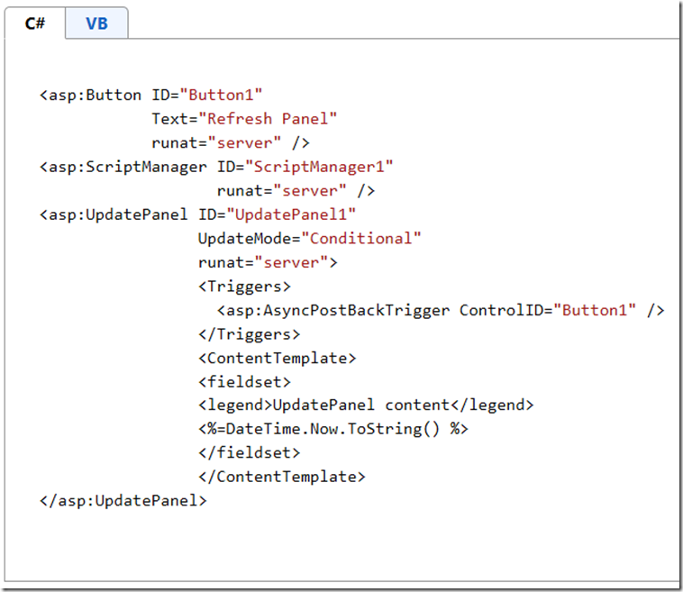
By default, any postback control inside an UpdatePanel control causes an asynchronous postback and refreshes the panel's content. However, you can also configure other controls on the page to refresh an UpdatePanel control. You do this by defining a trigger for the UpdatePanel control. A trigger is a binding that specifies which postback control and event cause a panel to update. When the specified event of the trigger control is raised (for example, a button's Click event), the update panel is refreshed.
The following example shows how to specify a trigger for an UpdatePanel control.
How UpdatePanel Controls Are Refreshed
The following list describes the property settings of the UpdatePanel control that determine when a panel's content is updated during partial-page rendering.
-
If the UpdateMode property is set to Always, the UpdatePanel control’s content is updated on every postback that originates from anywhere on the page. This includes asynchronous postbacks from controls that are inside other UpdatePanel controls, and postbacks from controls that are not inside UpdatePanel controls.
-
If the UpdateMode property is set to Conditional, the UpdatePanel control’s content is updated when one of the following is true:
-
When the postback is caused by a trigger for that UpdatePanel control.
-
When you explicitly call the UpdatePanel control's Update method.
-
When the UpdatePanel control is nested inside another UpdatePanel control and the parent panel is updated.
-
When the ChildrenAsTriggers property is set to true and any child control of the UpdatePanel control causes a postback. Child controls of nested UpdatePanel controls do not cause an update to the outer UpdatePanel control unless they are explicitly defined as triggers for the parent panel.
-
If the ChildrenAsTriggers property is set to false and the UpdateMode property is set to Always, an exception is thrown. The ChildrenAsTriggers property is intended to be used only when the UpdateMode property is set to Conditional.
Using UpdatePanel Controls in Master Pages
To use an UpdatePanel control in a master page, you must decide how to include the ScriptManager control. If you include the ScriptManager control on the master page, it can act as the ScriptManager control for all content pages. (If you want to register scripts or services declaratively in a content page, you can add a ScriptManagerProxy control to that content page.)
If the master page does not contain the ScriptManager control, you can put the ScriptManager control individually on each content page that contains an UpdatePanel control. The design choice depends on how you intend to manage client script in your application. For more information about how to manage client script, see ScriptManager Control Overview. For more information about master pages, see ASP.NET Master Pages.
In some cases, the ScriptManager control is on the master page and you do not need partial-page rendering capabilities for a content page. In those cases, you must programmatically set the EnablePartialRendering property of the ScriptManager control to false for that content page.
The following example shows markup for a ScriptManager control on the master page and an UpdatePanel control on a content page. In this example, a property named LastUpdate is defined on the master page and is referenced from inside the UpdatePanel control.
ASP.NET data controls overview
There are two types of ASP.NET data controls available in Microsoft Expression Web: Data Source controls, which allow you to set properties for connections to database or XML data sources, and Data controls, which allow you to display data from data sources specified in Data Source controls.
Data Source Controls
- AccessDataSource control The AccessDataSource control is a data source control that works with Microsoft Access databases. For information about programming the AccessDataSource control, see AccessDataSource Class in the MSDN library.
- SiteMapDataSource control The SiteMapDataSource Web server control retrieves navigation data from a site-map provider, and then passes the data to controls that can display that data, such as the TreeView and Menu controls. For information about programming the SiteMapDataSource control, see SiteMapDataSource Class in the MSDN library.
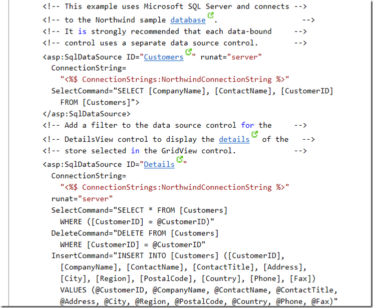
- SqlDataSource control The SqlDataSource control enables you to use a Data control to access data located in a relational data base, including Microsoft SQL Server and Oracle databases, as well as OLE DB and ODBC data sources. For information about programming the SqlDataSource control, see SqlDataSource Class in the MSDN library.
- XmlDataSource control The XmlDataSource control makes XML data available to data-bound controls. You can use it to display both hierarchical and tabular data, although the XmlDataSource control is typically used to display hierarchical XML data in read-only scenarios. For information about programming the XmlDataSource control, see XmlDataSource Class in the MSDN library.
For an overview of Data Source controls, see Data Source Controls Overview in the MSDN library.
AccessDataSource Class
The AccessDataSource class is a data source control that works with Microsoft Access databases. Like its base class, SqlDataSource, the AccessDataSource control uses SQL queries to perform data retrieval.
One of the unique characteristics of the AccessDataSource control is that you do not set the ConnectionString property. All you need to do is set the location of the Access .mdb file, using the DataFile property, and the AccessDataSource takes care of the underlying connection to the database. You should place Access databases in the App_Data directory of the Web site and reference them by a relative path (for example, ~/App_Data/Northwind.mdb). This location offers additional security for data files, because they are not served if they are requested directly by the client Web browser.
The AccessDataSource class does not support connecting to Access databases that are protected by a user name or password, because you cannot set the ConnectionString property. If your Access database is protected by a user name or password, use the SqlDataSource control to connect to it so that you can specify a complete connection string.
You bind data-bound controls to an AccessDataSource using the DataSourceID property of the data-bound control. For more information on binding a data-bound control to data source controls, see Binding to Data Using a Data Source Control.
Example:
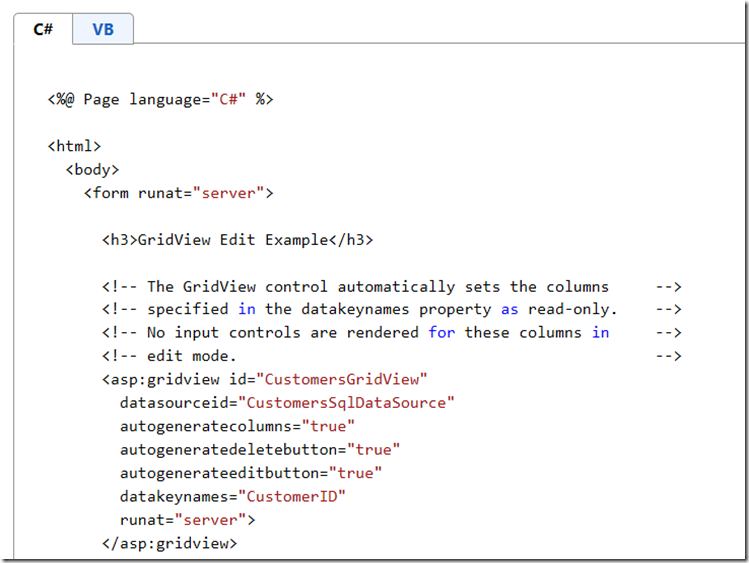
The following code example demonstrates a common display and update scenario with the GridView control. The SelectCommand property is set to an appropriate SQL query, and data from the Northwind database is displayed in the GridView control. Because a UpdateCommand property is also specified and the AutoGenerateEditButton property is set to true, you can edit and update the records with no additional code. The GridView control handles adding parameters to the UpdateParameters collection; the GridView control passes the parameter values for the BoundField objects first, followed by the values of fields that are specified by the DataKeyNames property. The GridView calls the Update method automatically. If you want to order the parameters, explicitly, specify an UpdateParameters collection on the AccessDataSource.
SiteMapDataSource control
The SiteMapDataSource control is a data source to the site map data that is stored by the site map providers that are configured for your site. The SiteMapDataSource enables web server controls that are not specifically site navigation controls, such as the TreeView control, Menu control, and DropDownList control, to bind to hierarchical site map data. You can use these web server controls to display a site map as a table of contents or to actively navigate a site.
The most common way to use a SiteMapDataSource is to specify it in the Data Source Configuration Wizard when you set the Data Source of a data-bound control such as the TreeView or Menu controls.
You can also add a SiteMapDataSource control to a page by dragging it from the Toolbox task pane onto your page. When the control is on your page, right-click it and choose Properties to open the Tag Properties task pane where you can set properties for the control.
Example:
SqlDataSource control
The SqlDataSource control enables you to use a web control to access data located in a relational data base, including Microsoft SQL Server and Oracle databases, as well as OLE DB and ODBC data sources.
The most common way to use a SqlDataSource control is to specify it in the Data Source Configuration Wizard when you set the Data Source of a data-bound control such as the GridView control, FormView control, DetailsView control, DataList control, or Repeater control.
You can also add a SqlDataSource control to a page by dragging it from the Toolbox task pane onto your page. When the control is on your page, right-click it and choose Properties to open the Tag Properties task pane where you can set properties for the control.
the SqlDataSource data source control represents data in an SQL relational database to data-bound controls. You can use the SqlDataSource control in conjunction with a data-bound control to retrieve data from a relational database and to display, edit, and sort data on a Web page with little or no code.
To connect to a database, you must set the ConnectionString property to a valid connection string. The SqlDataSource can support any SQL relational database that can be connected to using an ADO.NET provider, such as the SqlClient, OleDb, Odbc, or OracleClient. For information about securing connection strings, see How To: Secure Connection Strings When Using Data Source Controls.
To retrieve data from an underlying database, set the SelectCommand property with an SQL query. If the database that the SqlDataSource is associated with supports stored procedures, you can set the SelectCommand property to the name of a stored procedure. The SQL query that you specify can also be a parameterized query. You can add Parameter objects that are associated with a parameterized query to the SelectParameters collection. For more information on parameterized SQL queries and their syntax, see Using Parameters with Data Source Controls.
The SqlDataSource control retrieves data whenever the Select method is called. This method provides programmatic access to the method that is specified by SelectMethod property. The Select method is automatically called by controls that are bound to the SqlDataSource when their DataBind method is called. If you set the DataSourceID property of a data-bound control, the control automatically binds to data from the data source, as required. Setting the DataSourceID property is the recommended method for binding an ObjectDataSource control to a data-bound control. Alternatively, you can use the DataSource property, but then you must explicitly call the DataBind method of the data-bound control. Some examples of data-bound controls that can use SqlDataSource are DataGrid, DetailsView, DataList, and DropDownList. You can call the Select method programmatically at any time to retrieve data from the underlying database.
Example:
XML Data Source Control
The XmlDataSource control makes XML data available to data-bound controls. You can use it to display both hierarchical and tabular data, although the XmlDataSource control is typically used to display hierarchical XML data in read-only scenarios.
The most common way to use an XmlDataSource is to specify it in the Data Source Configuration Wizard when you set the Data Source of a data-bound control such as the GridView control, FormView control, DetailsView control, DataList control, or Repeater control.
You can also add an XmlDataSource control to a page by dragging it from the Toolbox task pane onto your page. When the control is on your page, right-click it and choose Properties to open the Tag Properties task pane where you can set properties for the control.
The XmlDataSource control is a data source control that presents XML data to data-bound controls. The XmlDataSource control can be used by data-bound controls to display both hierarchical and tabular data. The XmlDataSource control is typically used to display hierarchical XML data in read-only scenarios. Because the XmlDataSource control extends the HierarchicalDataSourceControl class, it works with hierarchical data. The XmlDataSource control also implements the IDataSource interface and works with tabular, or list-style, data.
Page developers use the XmlDataSource control to display XML data using data-bound controls.
The XmlDataSource typically loads XML data from an XML file, which is specified by the DataFile property. XML data can also be stored directly by the data source control in string form using the Data property. If you want to transform the XML data before it is displayed by a data-bound control, you can provide an Extensible Sylesheet Language (XSL) style sheet for the transformation. As with the XML data, you typically load the style sheet from a file, indicated by the TransformFile property, but you can also store it in string form directly using the Transform property.
The XmlDataSource control is commonly used in read-only data scenarios where a data-bound control displays XML data. However, you can also use the XmlDataSource control to edit XML data. To edit the XML data, call the GetXmlDocument method to retrieve an XmlDataDocument object that is an in-memory representation of the XML data. You can use the object model exposed by the XmlDataDocument and XmlNode objects it contains or use an XPath filtering expression to manipulate data in the document. When you have made changes to the in-memory representation of the XML data, you can save it to disk by calling the Save method.
There are some restrictions to the editing capabilities of the XmlDataSource control:
-
The XML data must be loaded from an XML file that is indicated by the DataFile property, not from inline XML specified in the Data property.
-
No XSLT transformation can be specified in the Transform or TransformFile properties.
-
The Save method does not handle concurrent save operations by different requests. If more than one user is editing an XML file through the XmlDataSource, there is no guarantee that all users are operating with the same data. It is also possible for a Save operation to fail due to these same concurrency issues.
Example:
Entity Data Source Control
The ADO.NET EntityDataSource control supports data binding scenarios in Web applications that use the ADO.NET Entity Framework. Like the Entity Framework, the control is available as part of the .NET Framework 3.5, beginning with SP1. Users accustomed to the design-time model of ASP.NET data binding controls will find the programming surface of the EntityDataSource control similar to the SqlDataSource, LinqDataSource, XmlDataSource, and ObjectDataSource controls. Represents an Entity Data Model (EDM) to data-bound controls in an ASP.NET application
Starting with the .NET Framework version 4, the EntityDataSource control supports the QueryExtender control that is used to create filters for data that is retrieved from a data source. The query extender control can filter data in markup of a Web page by using declarative syntax. For more information, see Applying LINQ Queries to EntityDataSource. The EntityDataSource control also allows you to filter data by programmatically applying LINQ to Entities queries on top of the ObjectQuery<T> that is associated with the EntityDataSource by implementing the QueryCreated event handler. To programmatically filter data, you do not need to add the QueryExtender control to the page. The query extender control will be created when the[ E:System.Web.UI.WebControls.EntityDataSource.QueryCreated] event of the EntityDataSource control returns a different query from the one that was passed to the event.
In the following example, a listbox is bound to the EntityDataSource control and the onquerycreated event is linked to the EntityDataSource1_QueryCreated event handler.
LINQ Data Source Control
The LinqDataSource control exposes Language-Integrated Query (LINQ) to Web developers through the ASP.NET data-source control architecture. LINQ provides a unified programming model for querying and updating data from different types of data sources, and extends data capabilities directly into the C# and Visual Basic languages. LINQ simplifies the interaction between object-oriented programming and relational data by applying the principles of object-oriented programming to relational data. For more information about LINQ, see LINQ (Language-Integrated Query).
By using declarative mark up, you can create a LinqDataSource control that connects to data from either a database or an in-memory data collection such as an array. In the declarative text, you can write all the conditions that are required to retrieve, filter, order, and group the data. When you retrieve data from a SQL database table, you can also configure a LinqDataSource control to handle updating, inserting, and deleting data. The control does this without requiring you to write the SQL commands to perform these tasks.
The LinqDataSource control gives you a way to connect a data control to a wide variety of data sources. This includes database data, data-source classes, and in-memory collections. The LinqDataSource control lets you to specify database-like retrieval tasks (selecting, filtering, grouping, and ordering) against all these types of data sources. You can specify modification tasks (updating, deleting, and inserting) against database tables.
You can connect the LinqDataSource control to any kind of data collection that is stored in a public field or property. The declarative markup and code to perform data operations are the same for all data sources. You do not have to use different syntax when you interact with data from a database table or data from a data collection like an array.
Connecting to Data from a Database
When you interact with data from a database, you do not connect the LinqDataSource control directly to the database. Instead, you interact with entity classes that represent the database and the tables. You can generate the entity classes through the Object Relational Designer or by running the SqlMetal.exe utility. For more information, see Object Relational Designer (O/R Designer) or SqlMetal.exe (Code Generation Tool). The entity classes that you create will typically be located in the App_Code folder of the Web application. The O/R Designer or the SqlMetal.exe utility will generate one class that represents the database and one class for each table in the database.
You connect the LinqDataSource control to a database class by setting the ContextTypeName property to the name of the class that represents the database. You connect the LinqDataSource control to a particular table by setting the TableName property to the name of the class that represents the data table. For example, to connect to the Contacts table in the AdventureWorks database, you set the ContextTypeName property to AdventureWorksDataContext (or whatever name that you specify for the database object). You set the TableName property to Contacts. The following example shows the markup for a LinqDataSource control that connects to the AdventureWorks database.
Connecting to Data from an In-memory Collection
When you connect to in-memory data collection like an array, you set the ContextTypeName property to the name of the class that contains the collection. You set the TableName property to the name of the collection itself.
Using the LinqDataSource Control with Data-bound Controls
To display the data from a LinqDataSource control, you can bind a data-bound control to the LinqDataSource control. For example, you bind a DetailsView control, a GridView control, or a ListView control to a LinqDataSource control. To do this, you set the DataSourceID property of the data-bound control to the ID of the LinqDataSource control. The following example shows a GridView control that displays all the data from a LinqDataSource control.
You can restrict which data (properties) are displayed by configuring the data-bound control not to automatically generate data control fields. You can then define those fields explicitly in the data-bound control. The LinqDataSource control retrieves all the properties, but the data-bound control displays only the properties that you specify.
Filtering Data with the Where Clause
When you compare the value in a property to a static value, you define the Where property by using the property and the static value. For example, to return only the records that have a ListPrice value greater than 1000, set the Where property to ListPrice > 1000.
You can use the && or and operator for logical AND and the || or or operators for logical OR. For example, set the Where property to ListPrice > 1000 || UnitCost > 500 || DaysToManufacture > 3 to return records with a ListPrice value greater than 1000 or a UnitCost value greater than 500 or a DaysToManufacture value greater than 3. To specify that all conditions must be true to return a record, you would set the Where property to ListPrice > 1000 && UnitCost > 500 && DaysToManufacture > 3.
When you compare string values, you must enclose the conditions in single quotation marks and enclose the literal value in double quotation marks. For example, set the Where property to 'Category = "Sports"' to retrieve only the records with the Category column equal to "Sports".
Creating a Parameterized Where Clause
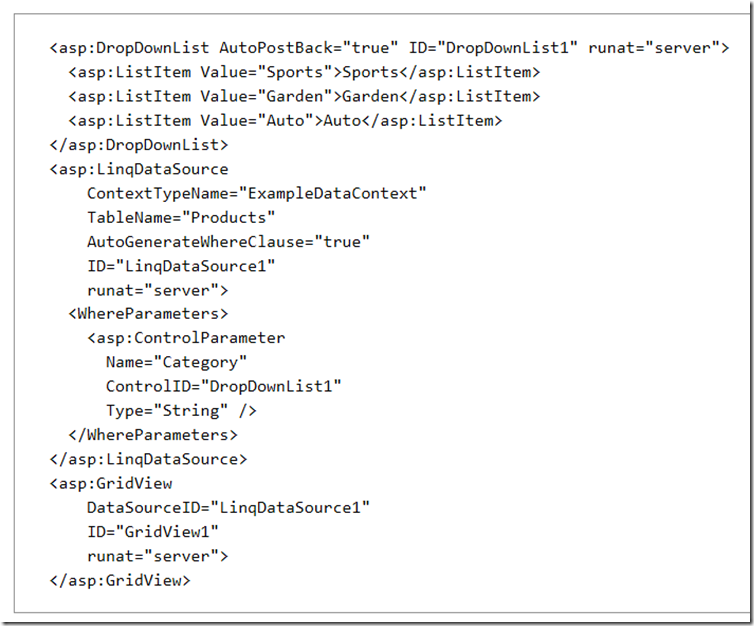
If you want to compare a property value to a value that is known only at run time, you define a parameter in the WhereParameters property collection. For example, if you want to filter by using a value that is provided by the user, you create a parameter that represents the value. The LinqDataSource control creates the Where clause with the current value of the parameter.
The following example shows a LinqDataSource control that retrieves data based on the user's selection in a control named DropDownList1.
Data controls with Data binding capability
We may use data binding to fill lists with selectable items from an imported data source, like a database, an XML file, or a script.
Example of Data binding with Radio button list control
The following controls are list controls which support data binding:
- DataList control The DataList control is useful for displaying data in any repeating structure, such as a table. The DataList control can display rows in different layouts, such as ordering them in columns or rows. For information about programming the DataList control, see DataList Class in the MSDN library.
- DetailsView control The DetailsView control gives you the ability to display, edit, insert, or delete a single record at a time from its associated data source. The DetailsView control displays only a single data record at a time, even if its data source exposes multiple records. For information about programming the DetailsView control, see DetailsView Class in the MSDN library.
- FormView control The FormView control gives you the ability to work with a single record from a data source, similar to the DetailsView control. The difference between the FormView and the DetailsView controls is that the DetailsView control uses a tabular layout where each field of the record is displayed as a row of its own. In contrast, the FormView control does not specify a pre-defined layout for displaying the record. Instead, you create a template containing controls to display individual fields from the record. For information about programming the FormView control, see FormView Class in the MSDN library.
- GridView control The GridView control displays the values of a data source in a table where each column represents a field and each row represents a record. The GridView control allows you to select, sort, and edit these items. For information about programming the GridView control, see GridView Class in the MSDN library.
- Repeater control The Repeater control is a data-bound container control that produces a list of individual items. You define the layout of individual items on a web page using templates. When the page runs, the control repeats the layout for each item in the data source. For information about programming the Repeater control, see Repeater Class in the MSDN library.
For an overview of Data Controls, see ASP.NET Data-Bound Web Server Controls Overview in the MSDN library.
DataList control
The DataList control displays data in a format that you can define using templates and styles. The DataList control is useful for data in any repeating structure, such as a table. The DataList control can display rows in different layouts, such as ordering them in columns or rows.
Example 1
Example 2
DetailsView control
The DetailsView control gives you the ability to display, edit, insert, or delete a single record at a time from its associated data source. By default, the DetailsView control displays each field of a record on its own line. The DetailsView control is typically used for updating and inserting new records, often in a master/detail scenario where the selected record of the master control determines the record to display in the DetailsView control. The DetailsView control displays only a single data record at a time, even if its data source exposes multiple records. The DetailsView control does not support sorting.
Example
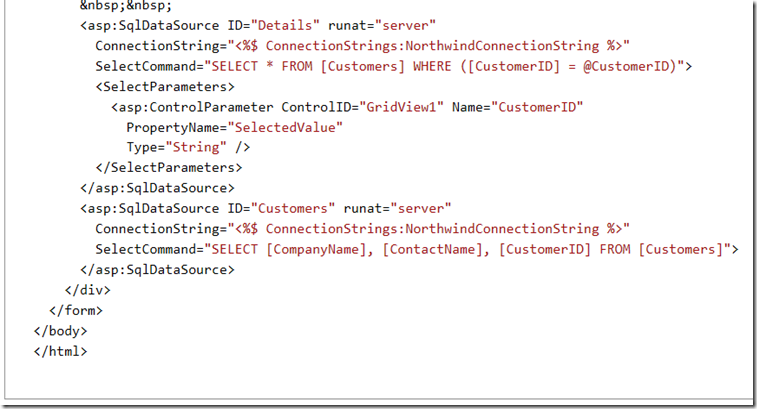
The following code example demonstrates how to use to use a DetailsView control in combination with a GridView control for a simple master-detail scenario. It displays the details of an item selected in the GridView control.
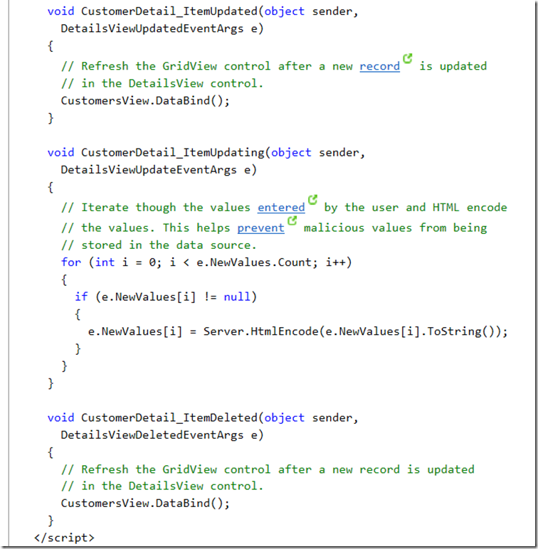
The following code example demonstrates how to use the DetailsView control to add, delete, and edit records.
FormView control
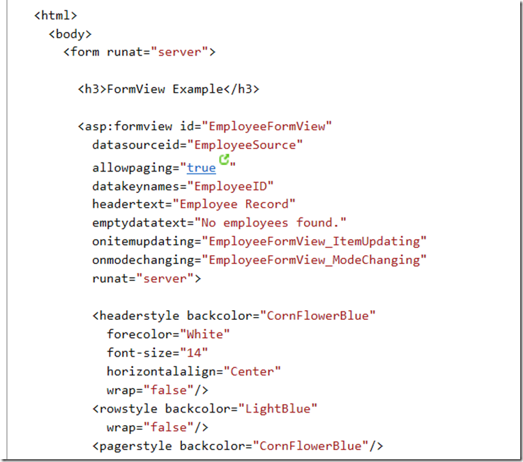
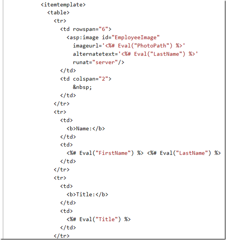
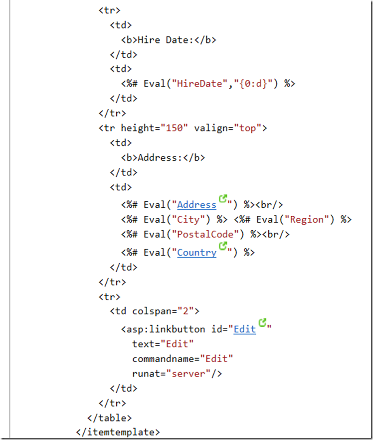
The FormView control gives you the ability to work with a single record from a data source, similar to the DetailsView control. The difference between the FormView and the DetailsView controls is that the DetailsView control uses a tabular layout where each field of the record is displayed as a row of its own. In contrast, the FormView control does not specify a pre-defined layout for displaying the record. Instead, you create a template containing controls to display individual fields from the record. The template contains the formatting, controls, and binding expressions used to create the form.
The FormView control is typically used for updating and inserting new records, and is often used in master/detail scenarios where the selected record of the master control determines the record to display in the FormView control. For more information and an example, see Modifying Data Using a FormView Web Server Control in the MSDN library.
Example:
The following example demonstrates how to use a FormView control to edit existing records.
GridView control
A recurring task in software development is to display tabular data. ASP.NET provides a number of tools for showing tabular data in a grid, including the GridView control. With the GridView control, you can display, edit, and delete data from many different kinds of data sources, including databases, XML files, and business objects that expose data.
Example:
The following code example demonstrates how to use the GridView control to edit records.
Repeater control
The Repeater control is a container control that allows you to create custom lists out of any data that is available to the page. The Repeater control does not have a built-in rendering of its own, which means that you must provide the layout for the Repeater control by creating templates. When the page runs, the Repeater control loops through the records in the data source and renders an item for each record.
Because the Repeater control has no default look, you can use it to create many kinds of lists, including the following:
-
A table layout
-
A comma-delimited list (for example, a, b, c, d, and so on)
-
An XML formatted list
The Repeater control is a basic templated data-bound list. It has no built-in layout or styles, so you must explicitly declare all layout, formatting, and style tags within the control's templates.
The Repeater control is the only Web control that allows you to split markup tags across the templates. To create a table using templates, include the begin table tag (<table>) in the HeaderTemplate, a single table row tag (<tr>) in the ItemTemplate, and the end table tag (</table>) in the FooterTemplate.
The Repeater control has no built-in selection capabilities or editing support. You can use the ItemCommand event to process control events that are raised from the templates to the control.
Example 1
Example 2
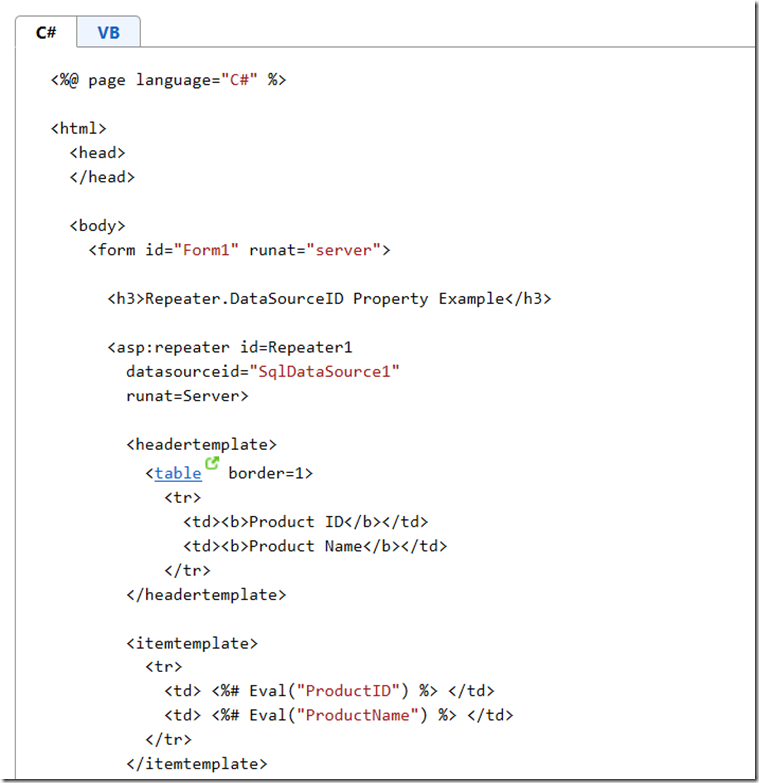
The following code example demonstrates how to use the DataSourceID property to specify the data source for a Repeater control. The DataSourceID property is set to the ID property of the SqlDataSource control used to retrieve the data. When the page is loaded, the Repeater control automatically binds to the data source specified by the SqlDataSource control and the data is displayed to the user.
ListView control
The ListView control is useful for displaying data in any repeating structure, similar to the DataList and Repeater controls. Unlike those controls, the ListView control supports edit, insert, and delete operations as well as sorting and paging. The paging functionality is provided for ListView by the new DataPager control.
The ListView control is a highly customizable control that enables you to use templates and styles to define the control's UI. Like the Repeater, DataList, and FormView controls, templates in the ListView control are not predefined to render specific UI in the browser.
The ASP.NET ListView control enables you to bind to data items that are returned from a data source and display them. You can display data in pages. You can display items individually, or you can group them.
The ListView control displays data in a format that you define by using templates and styles. It is useful for data in any repeating structure, similar to the DataList and Repeater controls. However, unlike those controls, with the ListView control you can enable users to edit, insert, and delete data, and to sort and page data, all without code.
Example
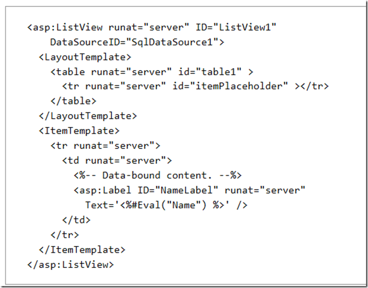
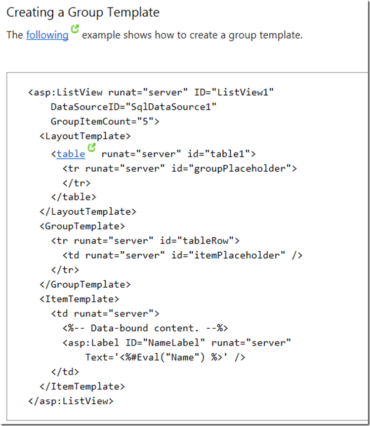
To display items in groups, you use a server control in the LayoutTemplate template to act as the placeholder for the group. For example, you might use a TableRow control. You set the placeholder control's ID property to groupPlaceholder. At run time, this placeholder control will be replaced with the contents of the GroupTemplate template.
You then add a placeholder control and set its ID property to itemPlaceholder. This control is only a placeholder for the other templates, usually the ItemTemplate template. As a result, at run time, this control will be replaced with the content from the other templates. The content is repeated the number of items specified by the GroupItemCount property of the ListView control.
Finally, you add an ItemTemplate template with the data-bound content to display inside the containing control for each item.
DataPager control
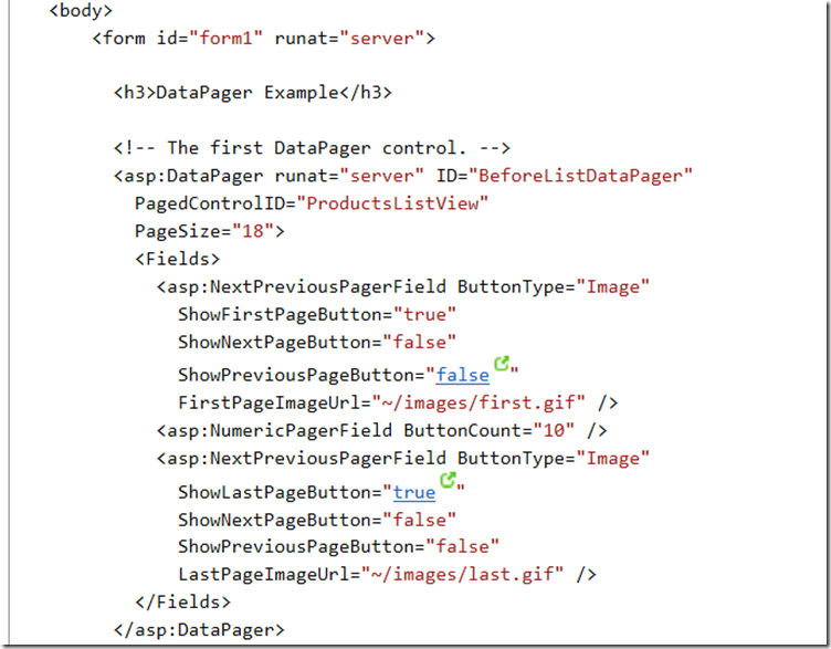
To enable users to page through data in either a ListView control or a control that implements the IPageableItemContainer interface, you can use a DataPager control. The DataPager control can be inside the LayoutTemplate template or on the page outside the ListView control. If the DataPager control is not in the ListView control, you must set the PagedControlID property to the ID of the ListView control. Provides paging functionality for data-bound controls that implement the IPageableItemContainer interface, such as the ListView control.
The DataPager control supports built-in paging user interface (UI). You can use the NumericPagerField object, which enables users to select a page of data by page number. You can also use the NextPreviousPagerField object. This enables users to move through pages of data one page at a time, or to jump to the first or last page of data. The size of the pages of data is set by using the PageSize property of the DataPager control. You can use one or more pager field objects in a single DataPager control.
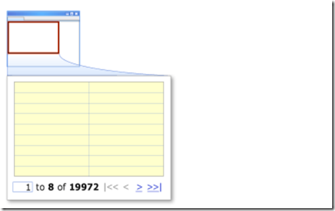
You can also create custom paging UI by using the TemplatePagerField object. In the TemplatePagerField template, you can reference the DataPager control by using the Container property. This property provides access to the properties of the DataPager control. These properties include the starting row index, the page size, and the total number of rows currently bound to the ListView control.
The following illustration shows paging UI that displays links to the next, previous, first, and last pages of data by using the NextPreviousPagerField object. The paging UI also includes custom content from a TemplatePagerField template, which displays the current item number range and the total number of items. The TemplatePagerField template includes a text box where users can enter the number of an item to move to. The specified item is displayed as the first item on the page.
Example
QueryExtender Control
The QueryExtender control is used to create filters for data that is retrieved from a data source, without using an explicit Where clause in the data source. The control can be used to filter data in markup of a Web page by using declarative syntax.
Filtering excludes data from a data source by displaying only the records that meet specified criteria. Filtering enables you to present varying views of the data that is in a dataset without affecting the data in the dataset.
Filtering typically requires you to create Where clauses to apply to the command that queries the data source. However, the Where property of the LinqDataSource control does not expose the full functionality that is available in LINQ.
To make filtering data easier, ASP.NET provides the QueryExtender control, which can be used with a data source to filter data by using declarative syntax. Using the QueryExtender control has the following benefits:
-
Provides richer expressions for filtering than writing a Where clause.
-
Provides a common query language for the LinqDataSource and EntityDataSource control. For example, if you use the QueryExtender with these data source controls, you can provide searching capability in a Web page without writing a model-specific Where clause or eSQL statement.
-
Can be used with LinqDataSource or EntityDataSource controls, or with third-party data sources.
-
Supports a variety of filtering options that can be used individually or together.
Example
The following example shows how to use the QueryExtender control to provide a search function in a Web page. The QueryExtender control uses the text that is entered in the TextBoxSearch control to search for contents in the ProductName and Supplier.CompanyName columns of a Products table in the data that is returned from the LinqDataSource control. The SearchExpression object is used to perform the search. The DataFields property specifies the data fields to search. The SearchType property specifies the type of search to perform. The ControlParameter element specifies the control that contains the text to use for the search. This code example is part of a larger example that is provided in Walkthrough: Filtering Data in a Web Page Using Declarative Syntax.
The following example shows how to use the QueryExtender control to search a Web page for values in a specified range. The QueryExtender control uses the values that are entered in the TextBoxFrom and TextBoxTo controls to search for values in the ProductName and Supplier.CompanyName columns of a Products table in the data that is returned from the LinqDataSource control. The ControlParameter element specifies the text box controls that contain the minimum and maximum values to use for searching the range. The MinType and MaxType properties specify that the minimum and maximum values must be included in the data that is returned. This code example is part of a larger example provided in Walkthrough: Filtering Data in a Web Page Using Declarative Syntax.
Differences between Repeater vs. DataList vs. ListView vs. GridView
If you look under Data tab on Visual Studio Toolbox, you can see several controls that could be used to display data from some data source, like database or XML file. Standard ASP.NET data presentation controls are:
- DataList,
- DetailsView,
- FormView,
- GridView,
- ListView and
- Repeater.
Every of these controls could be used to display data. Logical question is, why ASP.NET offers so many controls for same task? What are differences between these controls and most important, when to use each of them?
We can divide data presentation controls into two main groups.
First group consists of DetailsView and FormView control. These two controls can only show individual record at the same time. DetailsView and FormView are similar. Main difference is that DetailsView control has pre-built rendering, while FormView control requires template. Because of this, DetailsView demands less work, but FormView is more customizable.
In second group are Repeater, DataList, GridView and ListView control. These controls show collection of records, and are commonly called data list controls.
Repeater control features
Repeater control is derived from Control class. Repeater simply repeats data given in templates. Repeated data is usually HTML code mixed with records from data source. Repeater's output is not predefined. Because of that, Repeater demands most work to define template. In return it gives us most flexibility to build layout and optimize presentation.
With same template and same data set, Repeater usually works faster of DataList or GridView controls. This is mostly because of DataReader class, which is used for read only access. DataReader is faster than DataSet or DataTable classes commonly used with GridView.
Compared to GridView and DataList control, Repeater has limited features. By default, Repeater is good for displaying of data. It is not best choice if you need editing of data. Also, by default it doesn't provide paging and sorting of records.
DataList control features
Unlike Repeater, DataList control is derived from WebControl class. That gives it a number of style properties like BorderStyle, BackColor, ForeColor etc.
DataList is somewhere between Repeater and GridView, in many ways looks like a compromise between these two. DataList has more features but more limited in design when compared to Repeater. In the other hand, it has more flexibility and less features than GridView.
Also, DataList has RepeatDirection, RepeatColumns and RepeatLayout properties, which are unique for DataList control. These properties are useful when you need to create presentation with more than one record per row, like image gallery, product catalog etc. For example, let say you are creating an image gallery and want to show 5 images per row. Repeater would require checking of record position and manipulating HTML. With DataList, just use RepeatDirection="Horizontal" and RepeatColumns="5".
RepeatLayout could be Table or Flow, depending of do you need HTML table structure in layout.
GridView control features
Like DataList control, GridView is derived from WebControl class and includes numerous style properties. In addition to this, GridView is most complex control and have most properties. Numerous features include data paging, sorting, updating and deleting of records. First versions of ASP.NET had DataGrid control. GridView is replaced DataGrid in ASP.NET 2.0 as improved version of old DataGrid control.
GridView displays data in form of grid. Rows and columns are represented as HTML table. This is very useful if you need grid-like presentation. If you need to present data in table layout, then GridView requires a minimum of effort. In same time, if you want more customizable flow layout, GridView is not best option.
Common problem when using GridView control could be large ViewState which makes page loads slower and requires more bandwidth. This could be insignificantly on low traffic website, but keep in mind that for each second while the page loads, the percentage of visitors will become impatient and leave website. Also, massive view state is not good for SEO (search engine optimization).
One more problem is using of default pager on large tables or high traffic websites. If default paging is used, GridView will load complete dataset in memory, which descreases website's performances.
ListView control features
ListView control is newest data presentation control, introduced in ASP.NET 3.5. Previous controls (Repeater, DataList and GridView) logically follow each other. For example, Repater is simplest but fastest, then DataList has more features but more overheads too, and finally GridView is most complex, has most features, but heaviest and thus slowest on page.
Now, there is new ListView control which tries to provide best from both sides: speed and flexibility in design, and also a lot of features like paging, updating or deleting of records etc. Because of this, ListView control is often better choice than Repeater or DataList.
Flexibility in design comes with price. To use ListView, you'll probably have to write a lot of markup code. For simple table layout, GridView requires much less work.
ListView has new LayoutTemplate. Instead of Header and Footer templates, ListView has just LayoutTemplate. Main advantage of LayoutTemplate when compared to Header and Footer templates is that LayoutTemplate makes markup code looks more object oriented. So, it is not a big difference between these two models. It is possible to achieve same results with LayoutTemplate on ListView like with HeaderTemplate and FooterTemplate on Repeater, DataList and GridView.
Report Viewer Control
Microsoft Visual Studio 2013 includes report design functionality and ReportViewer controls so that you can add full-featured reports to custom applications. Reports may contain tabular, aggregated, and multidimensional data. ReportViewer controls are provided so that you can process and display the report in your application. There are two versions of the control. The ReportViewer Web server control is an ASP.NET AJAX control used to host reports in ASP.NET AJAX projects. The ReportViewer Windows Forms control is used to host reports in Windows application projects.
Viewing Report in Remote mode
The following example demonstrates how to render a report that has been deployed to a report server. This example uses the Sales Order Detail report that is included with the AdventureWorks2012 sample reports project.
The example uses integrated Windows Authentication so you first must enable impersonation. To do this insert the following line into the web.config file:
Viewing Report in Local Mode











































This blog is the general information for the feature. You got a good work for these blog.We have a developing our creative content of this mind.Thank you for this blog. This for very interesting and useful.
ReplyDeletePython Online certification training
python Training institute in Chennai
Python training institute in Bangalore
This comment has been removed by the author.
ReplyDeleteThanks For Sharing The Information Please Keep Updating us Information Shared Is Very Valuable Time Just Went On Reading The Article Python Online Training AWS Online Training
ReplyDelete